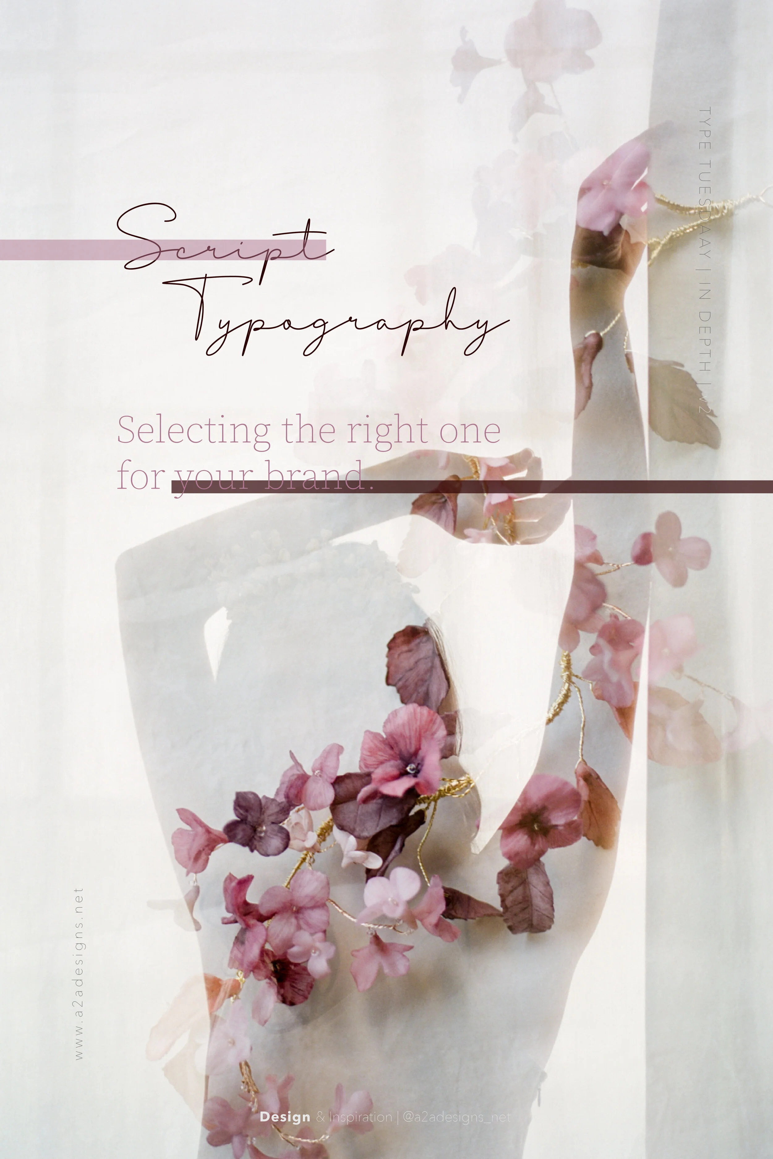
Script Typography - Selecting the right one for your brand
A couple of weeks ago we shared some of our most used free script fonts. If you haven’t read that blog yet, have a look here .
Our wonderful friend - the internet - has opened up this niche and given us all access to typography galore. Having this wide array of choice has put us in the particular position of having too much to choose from. So how do you choose the right font? Are there any rules that will give you a bullet-proof method to getting it right every time you venture out to choose the perfect script font for your brand? The simple answer is ‘yes’. Read along, because we are sharing our top 5 tips on how to do this.
What is the Message?
What is it that your brand wants to communicate? What is the audience your brand is trying to reach? What type of business are you? These are all questions which will provide you with the base for choosing the most suitable font. If your brand core values encompass themes like a sense of femininity, romance, grace, elegance, distinctiveness with added flair, then script fonts are your choice.
Font family & Type size
When selecting your script font also consider the font family. Look for big font families or ‘Super-families’. Super-families are font families that come with a variety of weights, widths, and styles to choose from, within the same typeface. Another thing to consider is the range of sizes at which the script will be used. Choosing a typeface that looks good and reproduces well in all of them is crucial.
Readability
Normally, script fonts tend to be very decorative, so checking for legibility is a must. Some script fonts are highly legible and easy to read at all sizes; others are less so. Make sure that every letter can easily be read and is distinguishable against other letters.
Features and Customisation
Some OpenType fonts contain a multitude of glyphs, including numerous swash characters, alternate letterforms and figures, ligatures, and flourishes. If you want to be able to customize and personalize your script setting, look for one that offers many options. Also consider whether you will be using the font in more than one language, and check if it includes all of the foreign language characters you need.
Print or Digital use?
Your intended reproduction method, as well as the intended surface, can have an impact on the script you choose. Many scripts have thin strokes that run the risk of either breaking up or disappearing entirely. If a piece will be reproduced digitally - online and via various devices - at low resolution, be sure to select a script that will maintain its integrity regardless.
Did you find this helpful? Do you have any further tips or tricks that you use when choosing your script fonts? Are there any other questions regarding typography that you’d like us to tackle? Please leave all your comments below. We can’t wait to read them!
For even more inspiration, make sure to hop on over to our Pinterest or Instagram profiles.
Happy Musings!!